原理
在css中,padding的百分比是相对于父容器的宽度的。将父容器的padding-top 或者 bottom 设为 100% 高度设为0,得到宽高相等的容器,使用决对定位将图片把父容器全覆盖。
css
  .img {
    position: relative;
    padding-bottom: 100%;
    width: 100%;
    height: 0;
    text-align: center;
  }

  img {
    position: absolute;
    left: 0
    bottom: 0;
    width:100%;
    height:100%
  }
html
<div class="img"><img src="bao.jpg" alt=""></div>
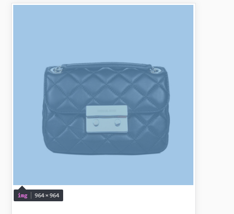
展示